After an intense week, the #museumweek initiative finally came to an end last Sunday. With more than 180.000 tweets, there have been a lot of people taking part of it, including more than 40.000 users and 600 museums.
During these days we have been collecting almost all the tweets published with the #museumweek hashtag. From the afternoon of March the 23rd until March the 30th we gathered and analyzed 165.444 posts (representing the 92% of the published tweets[1]), from 40.575 users.
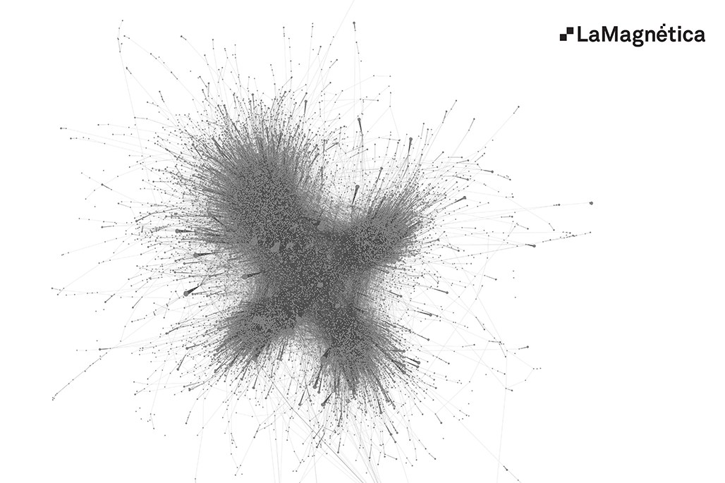
Now we want to go into detail in the analysis of the relationships between the different profiles who are taking part of the action, like we did in our previous post. That one included data from the first three days. If we take into consideration all those profiles who have published a tweet with the hashtag #museumweek and we link them with users who have mentioned another Twitter user or that have been mentioned by another profile, we get as a result the following network[2]:
And also 3.610 much smaller networks (components) not conected to the main one. This major component has the 97,5% of the tweets and about the 88% of users. It also contains those users who have been more active (we have erased some spammers), and almost every museum. We’ll focus our analysis on the main component, as we usually do on Social Network Analysis when there is such a giant component like this one.
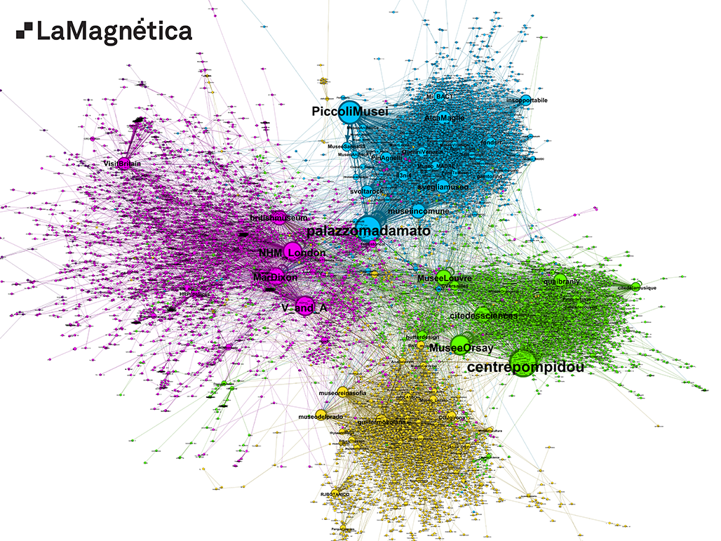
In order to interpret the interactions amongst the different profiles in a better way we are going to work on the main graph, removing from it all the links with two or less mentions. The resulting network is much neater and clear:
As it happened in the analysis of the first three days, we cannot depict the whole graph and keeping it useful and readable at the same time. It’s too big. So we trim the less relevant information and we keep the most active users as the core.
It is still a very large graph, but it renders enough detail and structure to be used as an analytic tool. To make it clearer we have made some changes in the visual rendering from our previous week post, moving some key players to the edge of their country community in order to reduce the number of crossing links.
The colors in the graph represent the community structure, the groups that have a strong interaction among its members and a lower one with the profiles out of the community. In technical jargon this is called modularity. The interesting point is that the community structure mimics almost perfectly the country structure. This is the same thing as saying that the Twitter talk has taken place mainly inside countries and that mentions between twitter users of different countries, although it is the key to understand the overall graph structure, have been a minority.
It is normal that users group themselves by countries, taking into consideration that this initiative is based on the interaction between users and museums in different languages.
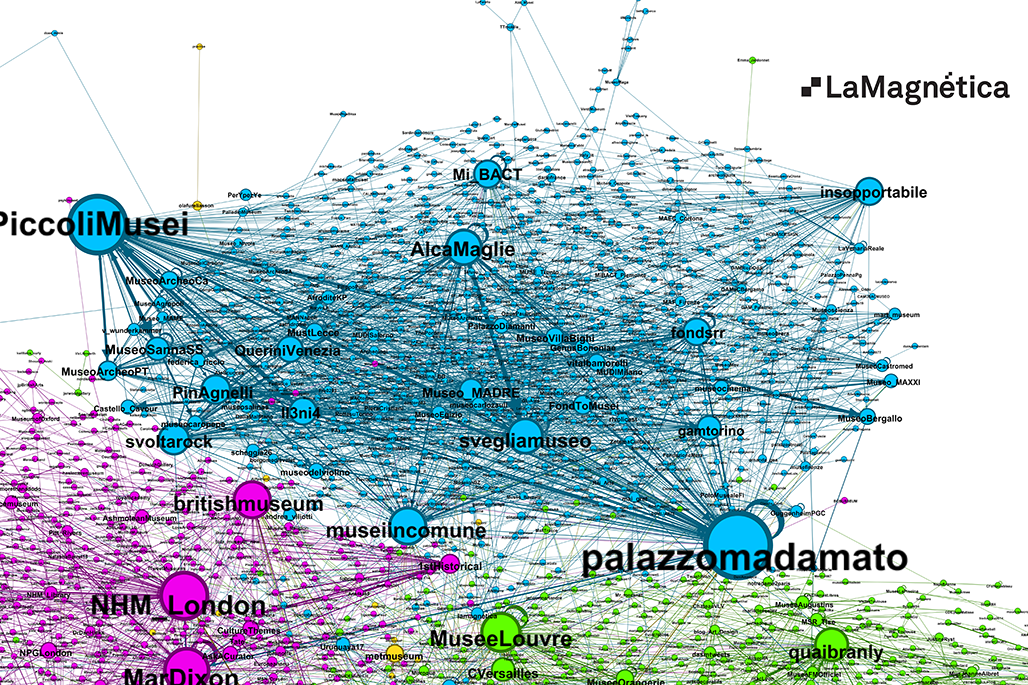
Compared to the different geographic communities that we showed in our previous post, we can observe how the Italian museums are increasing both in volume and relevance (the diameter of each circle is proportional to the mentions sent and received). Although it is going to be easier to confirm this fact in the relevance ranks, we can see that museums like Palazzo Madama from Torino, the Piccoli Musei da Roma or also Centre Pompidou from Paris have risen in the ranking.
The following image zooms into the Italian group, the one that has experienced the biggest change since our last analysis:
How to evaluate users’ satisfaction?
Results indicate that each one of the participants have published, on average, 4 tweets with the hashtag #museumweek. That includes museums, which in some cases have published hundreds of tweets, and users who have interacted with them with a lower average.
This fact makes us wonder how to evaluate users’ satisfaction in an initiative like this one. If the average were much higher, we could evaluate it from users’ behavior and not from what they say about the #museumweek.
But with an average so low we cannot do it. Of course, this is not the same as saying that the results are not satisfactory. It is just that in a so widespread action with few repeating users within this week, we cannot deduce satisfaction from their repeated behavior.
It would be great that someone –Twitter expert? Some data mining student?- dared to perform a semantic analysis to asses users’ satisfaction. Such a semantic analysis is not easy to do as #museumweek corpus of tweets involves several different languages. An alternative approach would be to extract a random sample of the 40.000 users involved in the list, and ask them through Twitter.
For sure the result would give us some tips on how to improve a second edition.
A compact network
Another useful approach to better understand #museumweek is to analyze the distance between two users ( that is, the number of links that connect each other through the shortest path).
The average distance of this graph is 5,6, and It’s really interesting to see that there is almost no change since our last analysis (5,5), although the global network has more than 11.000 new users. This means that the main profiles (museums and most active people) have created a strong network of interactions between them, and that when a new user joins the conversation, it only needs to interact with one of them to fit into the main frame. The maximum distance that we can find between two profiles (graph’s diameter) is 15 links, and this has not increased either.
We won’t go into details, but we can take some conclusions from those facts:
- When a user contacts a museum in #museumweek, the network facilitates the user to become aware of the presence of other museums which he had no previously knowledge. And it also helps to make it easier to interact with these “new” museums.
- The structure also shows a great potential to expand its user base, incorporating more people to the conversation in a future edition without dispersing them into islands barely connected the ones with the others.
This fact offers a positive assessment of the results obtained in this first edition, and the potential for the years to come.
Top Users and Museums
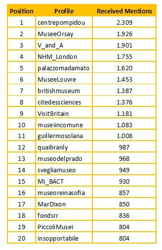
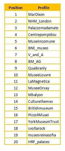
As we did in our previous article, we will show you now two different relevance ranks: ranking of profiles with more mentions received and ranking by centrality (that measures the degree of connection of a profile with the net).
Ranking by mentions received:
Ranking by centrality:
Other reviews to read about #museumweek:
Here you have a sum up post from Mar Dixon: http://www.mardixon.com/wordpress/2014/03/highlights-of-museumweek-please-add-your-favorites/
Some beautiful infographics: http://museumweek.antoinecourtin.com/dataviz3.html
In the following days we will publish more posts delving in the results from Spain and Italy.
[1] According to data from Topsy.com (http://topsy.com/analytics?q1=%23museumweek), posted on 31/03/2014
[2] We have erased from the graph the most active spammers in order to have a clearer network.

